Thursday, April 24, 2014

American Colonial

For the American period, I was in intrigued by the colonial style. The American colonies were built and established on fresh land and had to be built from the ground up. That being said, materials were scarce and had to be imported. Once resources became more accessibl, the Colonial or Early American style was created and ranged from 1565-1776.
 
I found the earlier homes and new establishment of towns the most interesting. The homes that were built during this time were very plain with straight lines and little detail, it was a very simple design with a slight European twist. Below are images of colonial homes during this era. The first image displays the common first home of an American and the second image shows how homes evolved into actual structures.

17th century home above.

18th century home above.
 
As for today's current design, the colonial style is commonly used today. It is a well known style and is shown in many modern day homes, as seen in the images below. These images show the classic design of the colonial period and how it is still used in current applications of design.


For the American period I decided to view Jessica and Lindsey's blogs. Jessica talked about the different types of colonial period from Dutch to French to German, etc. I found it very interesting and learned a little more from each set design. Lindsey also focused on the differnt reigons of colonial style. Both blogs discussed the colonial style from all reigons of European countries which was different from what I talked about, overall I found both blogs very imformational.


References
Wednesday, April 16, 2014

English Renaissance

The English Renaissance consisted of three eras, the early, middle and late renaissance. For my post I will be discussing the middle renaissance and how this period brought newer thoughts on design and new design styles. There was the introduction of William and Mary, Queen Anne, and four main designers: Chippendale, Adam, Hepplewhite, and Sheraton.
 
The style that was the most interesting was the Queen Anne design. This was the time of social living, so all design and furniture emphasized the use of parlors and sitting rooms. With this style the use of Chinese design and mahogany wood was very common. Queen Anne brought back the curved lines and the style of the cabriole leg, which was used in all types of furniture.
This is an Queen Anne winged chair with the cabriole leg.
This is a modern day version of the Queen Anne style.


Chippendale was a very known designer during this period of time and was very influential in his furniture designs. Some of these styles are displayed below, as he was most known for his different style of chairs. Chippendale's original designs are continuely used in current applications today.
Above is a Chippendale chair with the gothic style being emphasized.

Above is a modern day design which used CHippendale's chinese style chairs.
For the English Renaissance I viewed Katie and Kristina P's blogs. Both were very interesting and gave great knowledge about the English Renaissance era. Katie discussed the late Renaissance and how it was influential in its design. I learned more about the Adam style from her blog and glad she decided to discuss it since I did not in my blog. Kristina talked about the Queen Anne period, like I did, it was refreshing to read hers because she covered many thing that I did not cover, she went in more depth over the furniture. Both blogs were overall very interesting and each taught me something I didn't know before about the English Renaissance.
References

Wednesday, April 9, 2014

French Neoclassical

The French period had many different design elements to its overall time period. The period that was the most interesting was the French Neoclassical style. The Neoclassical style evolved from the time of 1760-1789. This was the time that architecture began to evolve once again. Architecture began to stray away from those of secular form and now used more rectangular forms. The curves of the Baroque began to fall away during this period and the use of straight lines and box shapes were more commonly placed throughout the architecture.
 
One of my favorite buildings during this time is the Petit Trianon. As we went over this structure in class, I grew a great admiration of the overall use of architecture and design within this piece of architecture. The most interesting part of this structure was the use of lines and rectangular shapes rather than curves, which was then the most common form of design in architecture. The colors of this period were more subdued and masculine; there was much use of gold, deep reds, as well as whites and neutrals. Below are images of the grand structure.


For current and modern day applications of the French Neoclassical style, one can see this style almost everywhere. See images below. All images display the use of rectangluar shapes and straight lines versus the curves and round shapes of past French periods.


For the French period I chose to view Flor and Dana's blogs. Flor also discussed the Neoclassical period and how it was inspired by the greeks. She also showed how the neoclassical period had less ornamentation and more austere than past periods of French design. In Dana's blog she discussed the Regency period and how it was a short period with a huge impact on design. During this period she discussed the loss of symmetry and the use of the cabriole leg in furniture. Overall, I learned new things from each period of French design.
E.C.
Below is a video of neoclassical design. I like this video because it has a slide of images that display the use of lines, squares, and rectangles that were used in this period. It gives a great sense of the general French Neoclassic period.


References

Monday, March 24, 2014

Spanish Renaissance

The Spanish Reaissance was just another branch of the Renaissance and occurred from the 15th to 17th centuries. Much like the Italian Renaissance, it had many Renaissance features with it's own Spanish twist on the overall concept of design.
 
One of my favorite pieces of the Spanish Reaissance was the Cathedral of Seville. This structure had a Gothic and Renaissance twist to it, from the gothic architecture to the Renaissance inspired vaulted ceiling. The overall structure is grand and over emphasizes the use of Gothic and Renaissnace design together in a cohesive setting.


Above is an interior view of the Cathedral of Seville.
This image displays the use of Gothic inspired ribbed vaulted ceilings.

With the development of new architecture and design, the next step was the developement of new interior and residential living. As the Spanish used materials such as, tile, stone, brick, wood, carpet, walnut furniture, and simple designs. The Spanish took the simplest designs from past civilizations annd put a new look to each piece of furniture.

Below is an image of a sillon de frailero (monk's chair)
 

Below is an image of an outdoor modern day patio set.
This displays the common use of a stretcher, at the base of the chair, this comes from the design of the monk's chair.

 
Below is a space that shows many Spanish Renaissance features,
 
For the Spanish Renaissance I viewed Emily N. and Melanie's blog posts. Emily discussed the use of Huerra architecture and how it was influential during the Spanish Renaissnace period. I viewed Melanie's for second time and she discussed the two styles of plateresco and desornamentado. Both posts discussed topics that I did not talk about in my post and I found them both very interesting to learn about.
 
References

Thursday, March 13, 2014

Italian Renaissance

The Renaissance spread through several European countries through the time of the 15th century to the 17th century. The Italian Renaissance, in particular, ranged from 1400-1600. The Renaissance came from the term "rebirth," as it began in Florence, Italy. The overall design is that of both the Gothic and Romanesque style.
 
The Italian Renaissance emphasized the use of a structure called a Palazzo. The Palazzo consisted of three divisions (by floors), compound windows, and heavy project cornice. The main floor plan relied on the use of vestibules, repair shops, summer apartments, and storage. The second and third floors were used as living spcaes and showed the unique features of this particular time of the Reniassance.
 
 
This is an image of the Palazzo Vidoni-Caffarelli.
An example of the common Palazzo style.
 
Above is an examples of a luxurious living space within a Palazzo. 
 
Current applications today:
 
The above image shows the use of arches and detail.
 
The above image also displays the use of arches and craftsmanship in cabinetry and the overall space.

For the Italian Renaissance I viewed Katie and Dana's blogs. Both had many interesting points and highlights on the Italian Renaissance. Katie discussed one of her favorite artists, Michaelangelo, and how he created the wonderful structure called the Medici Chapel. Dana's blog I had previously viewed but had viewed it again and have seen more interesting points in her blog. Dana discussed different Palazzos during the time of the Renaissance. Both blogs had equally interesting points and opened my eyes to more Itailian Renaissance aspects.
 
References

Sunday, March 2, 2014

The Americas

As a new world was discovered, so were new (yet old) civilizations. This period would be known as the Americas, from 200 B.C. to 1521 A.D. With these ancient times came ideas close to those of the Egyptians of new architecture and design but in a different geographical setting and climate.

As we went through the powerpoints in class, I found the Teotihuacan civilization very remarkable. This civilization dated 250 B.C. to 900 A.D. and is derived from the phase “place of the gods.” Aside from the entire civilization being very monumental the ceremonial center and overall city layout was very extraordinary. Below are images of the ceremonial center. These images don't even begin to describe how grand the actual temples are.


Along with the ancient monuments built by the Teotihuacan, they also had common motifs which were identified with their culture. These included: birds, butterflies, flowers, and abstract signs. These motifs were commonly used in daily design, along with design today.
 
Below is an example of a Teotiuacan pott, which was shown in class.
 
 
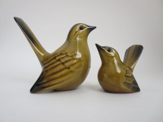
Below is an example of how birds are used today in design to add something to a space.


Below is an image of an outdoor space this gives this emphasize on overall old American style and how it is still used today in current applications.
 
 
Fir the period of the Americas, I reviewed Margaret and Emily P.'s blogs. Both blogs had reviewed the civilizations discussed in class. Margaret discussed the Olmecs and how jade stone was very treasured by this civilization and brought great aspects to design. Emily's blog, which I have reviewed before, talked about the Mayans and their three unqiue contributions of the ball court, the castillos, and the chacmools. Both posts talked about civilizaions that I did not discuss in my blog and I found them very interesting.

References

Friday, February 21, 2014

Gothic

The Gothic period, I find is one of the most influential and most important era for its unique taste in architecture, design, and dark elements. From the style of arches to the new form of vaulted ceilings, the Gothic era brought a new touch to European design.

Some important aspects of the Gothic design include: pointed arches, ribbed vaulted ceilings, and flying buttress. Along with those Gothic elements, the use of rose shaped stain-glass windows was frequently used in Gothis architecture and design.

 
Above is an example of the pointed arch. Instead of curved arch from previous eras.
 
Above is an image of the flying buttress design of the Gothic era.
 
 
Above is an example of the ribbed vaulted ceiling. It comes to a point at the top.
 
Lastly, above is an example of the rose shaped glass that was commonly used in Gothis design.

One of my favorite structures and one of the most classic churches of the Gothic period is the Notre Dame at Paris. This structure is very grand from the inside and out. It displays arches, the flying buttress, ribbed vaulted ceilings, and rose stained-glass windows. Below are images of the exterior and interior of the Notre Dame.


As for modern day, Gothic style is commly used. The Gothic style had made it's footprint on modern design and made way for modern architecture today. Below are some examples of current applications of Gothic style.


For the Gothic period, I viewed Samantha and Natalie's blogs. Both made very intersting points in their blogs and discussed the many aspects of the era. Samantha discussed the weightlessness that the pointed arches brought, as in they no longer pushed outward for support. She also displayed how the Eiffel Tower was a great example of Gothic deisgn. In a different approach, Natalie discussed a cathedral that she had previously visited in Siena, Italy. She showed pictures of the arches, columns, and painted walls that were displayed within the cathedral. Both posts discussed very interesting topics and displayed ideas that I didn't think of covering.

References